maybe it looked better on paper?

i don't even know where to begin with this...
3-floors of sheer design monstrosity, the continental midtown is credited with breathing new life into what was once an ailing chestnut street corridor. however garrish, tacky, and all around obnoxious the life may be, you can't deny there's more of it. (if you've ever been around on a friday or saturday night, you know exactly what i mean.)
outside, the midtown announces itself with an oversized arrow paired with a martini olive, a nod to the original continental's pendant fixtures. out-of-place hexagonal red tiles backdrop flimsy-looking table-chair sets and a couple (2) ferns in plastic containers for a sad-looking street view. on the second tier, a series of new circular windows (installed a full year after opening, oops) sit in what appear to be square cutouts... ? double oops. the third floor shows very clearly the office within at night while the top floor houses some thirsty-looking plants and a large sky lounge/bar... about which i oddly don't have anything bad to say. go fig.
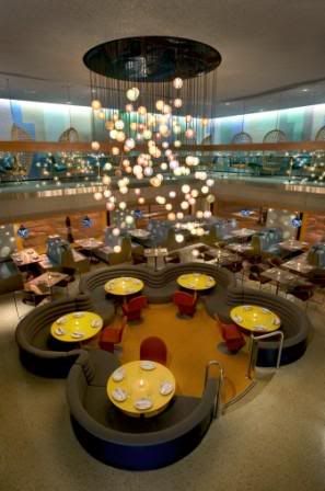
entering the space, please be careful not to get caught behind the automatic-sliding-door-vestibule/airlock, which will invetibly happen if there's even one person waiting at the host station. not sure why it's so damn close to the front door, unless maybe that was an afterthought too? likely so. whatever the case may be, once inside the double-story space announces itself quite well: mod-green booths line the perimeter wall, a sunken floor holds several large banquets in the center, and a colorful glass-globe chandelier drops down from above. the retro vibe is apparent and wholly kitsch, but fun nonetheless.
you may notice, however, a few mis-steps in the first floor design. like those same outdoor tables now oddly clustered in the back of the room (surely a buzzkill to any would-be scenester). or maybe your eyes caught the glittered popcorn, yes popcorn, ceiling. and did you take note of the waiting guests standing against the stairwall? perfectly in the way of servers running food around a blind corner. and my, that sunken space in the middle is awfully large, isn't it? yes, it is.
on the second floor, most apparent are the large, hanging, wicker.. basket... chairs? wicker.hanging.moving.seats.... eating / drinking / moving / digesting... ? i just don't get it.
there's also banquet seating here, which makes sense in the space. and they would work well, if only they could get the seat heights match. it's a quietly disturbing sensation to be at 30" off the floor while your dining companion is at 36". you should try it sometime. or not.
ok, in the back there's carpet on the ceiling, a few plastic animal-like seats, and some mildly interesting tables too. sorry, i'm getting tired here...
let's finish our complaints in bullets:
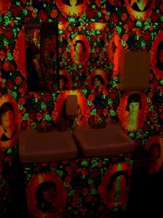
an elevator that only holds six, doesn't stop at the second floor, and is remarkably slow.servers in clothes at least 3 sizes too short/small. can you say overhang??less offensive, but equally annoying: 6 barstools in a space that could easily hold 12.bathrooms with two-way mirrors OR scuzzy carwash flap entryways- your choice!vibrating buzzers for waiting guests ala the olive garden. now that's hospitaliano.last but not least: THIS ISN'T MIDTOWN!umm, sooo.... i like their mashed potatoes?
more stuff:
stokes architecture- should have their good taste license suspended. bad architect! BAD.
continental midtown website- yep, that's them.
(some photos courtesy sro. oops.)
 (thesis house construction)
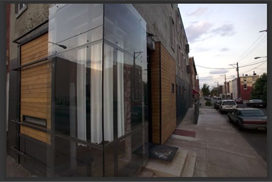 (exterior)
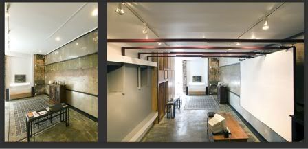 (interior)