oops, new site host!

in a moment you'll be redirected to

designphiladelphia

10.06.2007

birds, bunnies and deer, oh my

enough already, the novelty's worn off folks...


these woodland creatures now grace pillow prints, wall decals, night lights, tshirts, paper graphics, woolen accessories, tatoos, wallets, jewelry, bottle stoppers, street graffiti, and assorted tchatchkes all. cute and fluffy as they are, i'm afraid the population explosion is too much for the design ecosystem to handle... obviously a controlled killing is the only option.

i'm sorry, but it's really for the best.

8.27.2007

welcome to hell


ergopod 500
"programmers, CAD workers, graphic designers or special needs individuals now have the ideal station for hours at the computer"

8.23.2007

brand loyalty?


not fooling anybody
a chronicle of bad conversions and storefronts past

8.20.2007

random house

for sale in south kensington...


i should have been looking for water damage. oh well.

8.10.2007

green screen


"If Google had a black screen, taking in account the huge number of page views, according to calculations, 750 mega watts/hour per year would be saved."

blackle

7.31.2007

pretty


in pink.

7.25.2007

out of site


how big was that number?

statistics made visual

7.20.2007

big green building


A sustainability research facility with real-world product testing... in Philadelphia, really?

"Urban Green Partnership’s Big Green Building is 80,000 square feet, 8-story building with underground parking, retail, office and residential units, research lab and a community garden. The entire building is self-sustaining so it will consume the energy it creates."

Of course, they have to tear up the local community garden to make way for the big green building. Philly, gotta love it here... ;)

Urban Green Partnership
Big Green Building

7.17.2007

mr kim says- hip hop extraordinaire


"sf visit"

mr kim says
a left coast journalist/promoter chronicles his life. links to dozens of great sites throughout, decent pics and vids, as well as events, reviews, and promotions. graphic, clear, and an altogether easy read. good stuff.

6.10.2007

ending-start

3 years and $75,000 later...


the award for an outstanding thesis goes to: "center for change: using local resources to create a space for art"

very, very nice. :) too bad it doesn't come with a job offer though...
_____________________________________________________

so one project down, and now another beings: this appropriately-titled blog o mine has focused on philly's design scene exclusively from the start. all the while, my magazine collection, favorties folder (bookmarks on mac, of course) and hand-/digitally-written notes to myself have grown steadily with international design-related sites over the last few years... and so the future of this thing is going to be a lot more stream of consicousness (ie less words/more pictures) and as a consequence, a lot less local-only too...

but fear not, i'm not completely giving up on the city. there's still going to be some philly bits scattered around... they'll just be mixed with other items i come across. new and old, recycled and fresh, digital, print, and in person, i think it's going to be a good time for you and for me. :) stay tuned.

4.30.2007

urbn hq

building 543 highlighted for an easy read...


the last and certainly not least in my furniture show/navy yard/saturday afternoon wandering series. get your coffee now, this one's less of a soundbite... ;)

a former shipbuilding factory situated on the mucky coastline of the delaware has been reinvented as a modern hipster mecca of sorts. outgrowing their offices with an expanding set of brands, urban outfitters recently moved from a classically styled building at 17th/locust to their biggie-sized space in the navy yard. the new headquarters features not only offices, meeting rooms, and certainly a sea of workstations, but also a boutique retail store, public cafeteria, lounge areas, and what office wouldn't want a koi pond too? sure, why not... design studios for their major labels- urbn, free people, and anthropologie are housed in a communal grouping of buildings nearby. equally impressive, for sure, but just too much info for my short attention span. ;)

did you know the billion-a-year urbn enterprise was founded in west philly some 25ish years ago? now you do.

a repurposed water heater, abandoned rail tracks, shiny new facade and all around fantastic zen landscape lead me to the unlocked/unsecured front door of building 543. completed by d.i.r.t. studio as part of the adaptive reuse project, the brand's identity and new setting merge oh so nicely. a really outstanding piece of work with languid pools of rough stone, i-beams as luminaire housing, and waste-filtering trees bordering the former naval warehouses. "waste become the design fodder of the future" pretty much sums up their schtik and makes a whole hell of a lot of sense too. did someone say thesis project?

stumbling around the site openmouthed and giddy, i somehow managed to find my way inside the hq. (the unlocked and unsecured door didn't hurt either.) walking in on the interior design was just such a thrill. i'm a longtime fan of the bohemian-shiek style of urbn stores and this space is no different. the old and the new overlap one another throughout while a touch of whimsy balances it all (did i really just use that word?). some highlights:

  • an industrial-finished gallery wall for photography
  • the aforementioned koi pond with wood block stumps set about
  • a hanging plant garden, ship anchor chain and hot pink mural at the entryway
  • display stands with i-beam overhangs and pendant lights just a little too cute and fussy for this guy
  • circulation megastair in concrete and steel
  • bark-bare sapling logs as screening (found objects?)
  • salvaged signage, materials, and other such items scattered throughout

  • while ms&r architects certainly did a fine job, the departure from their longtime collaboraters in otto design group is at once notable and peculiar. was the scale of the spaces perceived as too much for a small studio accustomed to retail stores? was the extent of the adaptive reuse more familiar for the midwest architects? was it simply or a mater of changing directions or was there a falling out between the two parties? i've no idea, and this isn't a gossip column afterall...

    what is clear is that the overall look of urbn, created and developed by odg over the years remains intact. (a tribute to their forethought and skill, definitely.) in my mind, however, there are subtle issues with execution. most striking is the lack of design vignettes within the space. with the exception of the pond, most of the other zones are isolated and feel somehow incomplete (not the use of grayscale-color contrast in my pics. it's not just for effect, it also helps you to focus.) morevoer, urban's long history of art-architecture-design seems to flow less readily in this interior. architecture takes obvious precedent here, maybe for the setting, but still slightly uncomfortably so. a few placements of furniture and a simply graphic mural don't offer much in the way of at-ease-ment for me, especially in the overwhelming volume of the space. perhaps these despartures are intentional as the environment is meant for work, not merchandising? and of course too i only trespas- *ahem* wandered in the main space, not the flanking offices... so another investigation may reveal more information.

    whatever the case may be, even these critiques fall away when you realize it's a commercial office setting. not quite a cube farm, with glaring fluorescents and drop ceilings most of use are used to. suffice to say i'm sure i could get over the fussy pendants if i had to... ;)

    msr architects- minnesota/maryland based arch-design firm with many more pics of the urbn site

    dump it right there studio- i like the abbreviated name better, but good god you've got to check out their work

    otto design group- multidisciplinary design studio in old city

    metropolis magazine- an article on the new urbn hq by ms. niga saffron, arch critic for the philly inq..... who knew my lil o' blog was so cutting edge?? ;)

    4.13.2007

    philadelphia naval yard

    taking a stroll in the furniture show surrounds...


    red brick on an overcast day can make any photo look great. ;)

    it's funny how something can be right under your nose and you never notice it. i'd heard about the naval yard for years now, imagining a post-industrial wasteland of oversized warehouse shells rusting off the river. but what i found was more a labrynth of classically-styled buldings nestled in what i can't help but describe as a... Community. who knew!

    the buildings are rather nice, don't you think? a bit on the dinosaur size, but perfect for subdivision, event hosting (ala the furniture show) or even an urban outfitters headquarters. but more on that another time...

    a bit of background research lead to more discoveries. apparently the setting has been declared a KIZ (i for innovation, not o for opportunity, natch) which sets it up for all manner of tax credits, grants, and development opportunities. besides the shipyard, marina, and historic core, the naval yard also has a corporate center, research park, nearby sports complexes, restaurants, and retail outlets as well. oh and- let's not forget their very own pulled pork stand too, who could ask for anything more?

    navy yard website- includes information on history, master plan, future development and even a newsletter.

    the center for land use interpretation links and some more info, but their pictures aren't nearly as nice as mine. ;)

    dirt studio- just a teaser for now, more on this fantastic bunch soon enough

    3.26.2007

    philadelphia furniture show

    a picture says a thousand words?

    ugh.

    uhh...

    *&^$%???

    whee!

    holy!

    oh!

    bahdeebahdu- putting other vendors to shame since 2001 (and a damn find place to work too) ;)

    3.17.2007

    design philadelphia 07

    it's that time of year again...


    (consider this a prequel to the run of posts i'm planning in the days ahead...)

    combining design, art, and architecture, this year's event has over 50 participating firms, studios, artsits, architects, online/print journals, retail venues, landscaper architects, industrial-interior-graphic designers, universities, galleries, and organizations hosting tours, lectures, exhibits, workshops, open studios, openings........ well, you get the idea. it's kind of a big deal. ;)

    runs april 12-22, most events free and open to the public. very nice.

    designphiladelphia website- one stop shopping for pics, calendar, events, and links too. good times.

    (pics from the site itself, thankyouverymuch)

    2.22.2007

    the arden theater

    a better case study for my thesis couldn't be found...

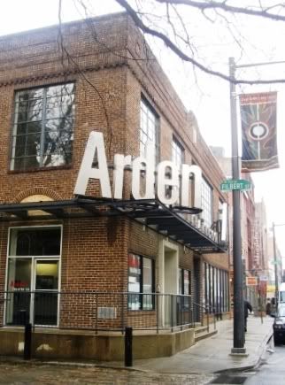
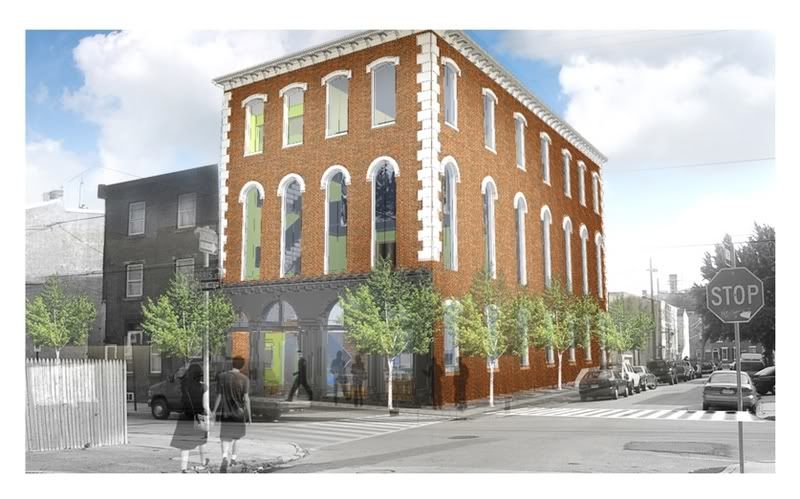
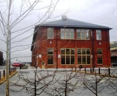
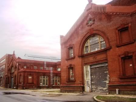
    large, attractive signage/street presence

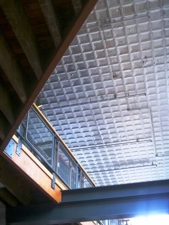
    humble materials, a mix of old and new

    circulation as a defining element
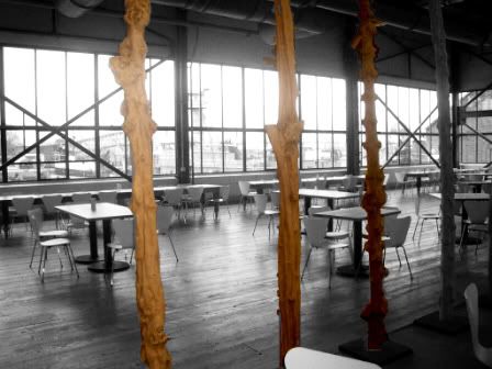
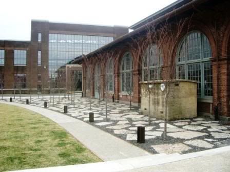
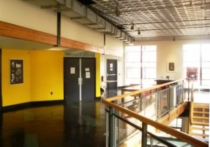
    spacious interior

    wayfinding designated by color

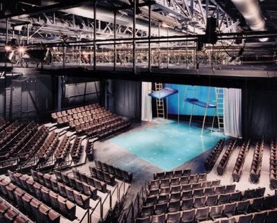
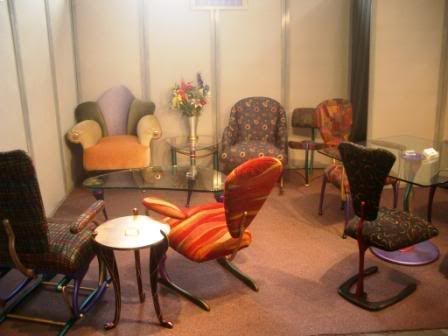
    black box style- a versatile floor & lighting plan

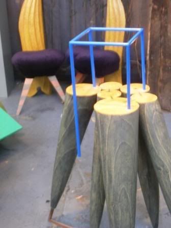
    the further i delve into my thesis project, the more i realize that theaters are a special building type all their own. with elements of both retail and arts spaces, these cultural centers are a hybrid of the two, but in many ways act like neither. operating at capacity for up to10 shows a week, even smaller stages must manage large-scale issues (like crowds, advertising, and code regulations) with both finesse and apparent ease. all in all, i'm developing a great deal of respect for people who dedicate themselves to theater design...

    a recent tour of the arden offered some great insight and backed up my own research. i went during the day when it was empty, but hope to return on a show night for a different perspective...

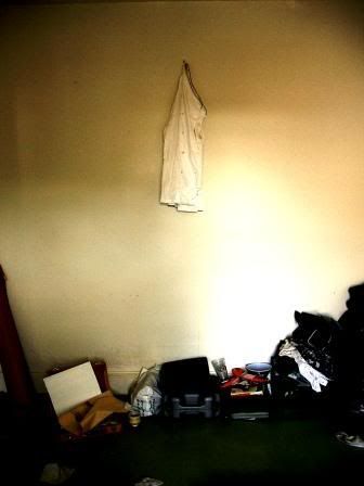
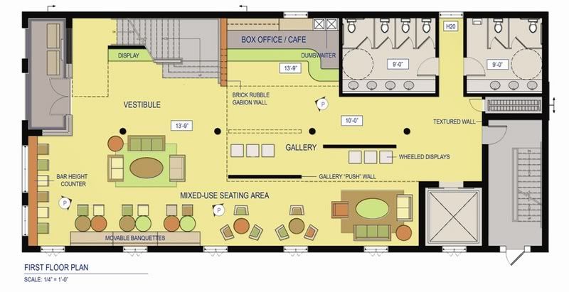
    walking into the arden, my first impression was how much larger the space appears than from outside. planning for both comfort and safety, circulation is a pressing issue in theater design. as lobby spaces often seem voluminous when not in use, many designs feature interesting ceiling plans or lighting to draw the eye to other elements within. the arden is rather spare in this regard, though a central stair serves as a focal point. simple wood and steel, the opening doesn't face the exit, but rather the back. i'm not sure why it was planned in this way, other than possibly to create a more relaxing space (ie so you don't feel pushed out the door).

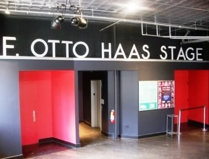
    another item of note are bold blocks of color that indicate entrances to performance space and large avenues and openings designate restrooms and exits. wayfinding (which means exactly as it sounds) is apparent without graphics or other such signage in this case. a very important detail, so i've read.

    additionally, in a space where the focus should be on the actors, the arden's simple materials and bold architecture serve the theater well. moreover, mixing old and new elements gives the theater a historical, established presence. the combination of these factors offers cost savings to the business owner, which can be passed along to performers, their shows, and the attendees alike.

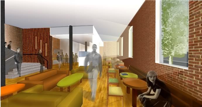
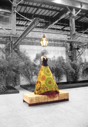
    the arden's trademark black box theaters seem to be the ideal for smaller troupes and shows. the term "black box" means just that- a simple, dark room with no fixed walls or built-ins. this makes the space easier to outfit and change from show to show. proscenium stages (like the one you probably had in high school), are the traditional standard and seem to be making their way back en vogue though. all in all there's not much to say about these no-frills portions of the arden; to my untrained/nonperformer eye they appear... sufficient.

    from what little i do know about designing public spaces, i do have a couple of critiques...

    • no vestibule means both cold and hot air can sweep through the space unhindered, upping costs and making for an uncomfortable intermission
    • only a very small overhang protects theatergoers from the elements, pre-theater lines and smoke breaks can't be fun in bad weather
    • this is relatively minor, but the box office could be played up and/or integrated in the space a bit more. right now it's just drywall and windows... ho-hum.

    all in all, a very successful trip, i'd say. thanks to meghan and the rest of the staff at the arden for the tour and all their help... (more info below)


    arden theater website - for showtimes, reviews, workshops, and pictures galore

    kieran timberlake associates- local, progressive architects in charge of recent renovations... who knew philly had such cutting-edge designers...

    further reading:
    "building for the arts, a guidebook for the planning and design of cultural facilities"- for the layman, everything from design & financial worksheets to drumming up community support and surveying local arts organizations

    "building type basics for performing arts"- architect-focused space planning, materials, acoustics, lighitng, and codes

    (last photo from kta website)