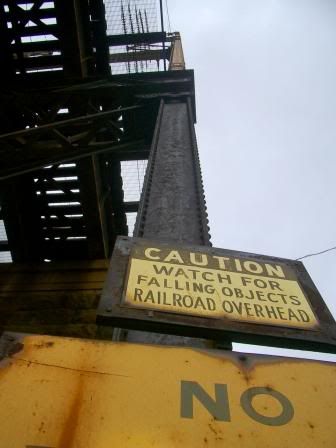

just a quick couple photos for fun.
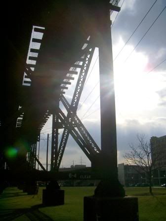
i've always liked this stretch of the amtrak (i think?) bridge near chestnut and 32nd. great materiality, repetition, shape, scale... worth noting too are the levels of contrast: heavy, massive pylons/thinner vetical supports, rectangular shapes/unfolding triangles, rusted metal/lush grass. even figuratively, if you want to go that far: in the summer students play touch football, soccer, or lacrosse on what i imagine was once a barren industrial site.
one of my favorite parts is the low stretcher marked "6-4 CLEAR." i'm not sure why, but maybe it somehow humanizes the structure? that for all of its weight and command it still addresses the person, something every type of design should consider...

No comments:
Post a Comment