

the last and certainly not least in my furniture show/navy yard/saturday afternoon wandering series. get your coffee now, this one's less of a soundbite... ;)
a former shipbuilding factory situated on the mucky coastline of the delaware has been reinvented as a modern hipster mecca of sorts. outgrowing their offices with an expanding set of brands, urban outfitters recently moved from a classically styled building at 17th/locust to their biggie-sized space in the navy yard. the new headquarters features not only offices, meeting rooms, and certainly a sea of workstations, but also a boutique retail store, public cafeteria, lounge areas, and what office wouldn't want a koi pond too? sure, why not... design studios for their major labels- urbn, free people, and anthropologie are housed in a communal grouping of buildings nearby. equally impressive, for sure, but just too much info for my short attention span. ;)
did you know the billion-a-year urbn enterprise was founded in west philly some 25ish years ago? now you do.
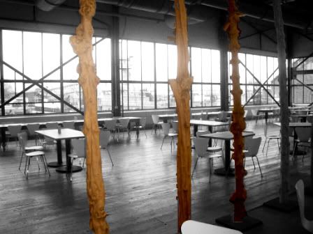
a repurposed water heater, abandoned rail tracks, shiny new facade and all around fantastic zen landscape lead me to the unlocked/unsecured front door of building 543. completed by d.i.r.t. studio as part of the adaptive reuse project, the brand's identity and new setting merge oh so nicely. a really outstanding piece of work with languid pools of rough stone, i-beams as luminaire housing, and waste-filtering trees bordering the former naval warehouses. "waste become the design fodder of the future" pretty much sums up their schtik and makes a whole hell of a lot of sense too. did someone say thesis project?
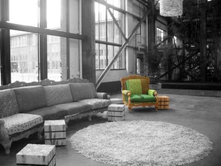
stumbling around the site openmouthed and giddy, i somehow managed to find my way inside the hq. (the unlocked and unsecured door didn't hurt either.) walking in on the interior design was just such a thrill. i'm a longtime fan of the bohemian-shiek style of urbn stores and this space is no different. the old and the new overlap one another throughout while a touch of whimsy balances it all (did i really just use that word?). some highlights:
while ms&r architects certainly did a fine job, the departure from their longtime collaboraters in otto design group is at once notable and peculiar. was the scale of the spaces perceived as too much for a small studio accustomed to retail stores? was the extent of the adaptive reuse more familiar for the midwest architects? was it simply or a mater of changing directions or was there a falling out between the two parties? i've no idea, and this isn't a gossip column afterall...
what is clear is that the overall look of urbn, created and developed by odg over the years remains intact. (a tribute to their forethought and skill, definitely.) in my mind, however, there are subtle issues with execution. most striking is the lack of design vignettes within the space. with the exception of the pond, most of the other zones are isolated and feel somehow incomplete (not the use of grayscale-color contrast in my pics. it's not just for effect, it also helps you to focus.) morevoer, urban's long history of art-architecture-design seems to flow less readily in this interior. architecture takes obvious precedent here, maybe for the setting, but still slightly uncomfortably so. a few placements of furniture and a simply graphic mural don't offer much in the way of at-ease-ment for me, especially in the overwhelming volume of the space. perhaps these despartures are intentional as the environment is meant for work, not merchandising? and of course too i only trespas- *ahem* wandered in the main space, not the flanking offices... so another investigation may reveal more information.
whatever the case may be, even these critiques fall away when you realize it's a commercial office setting. not quite a cube farm, with glaring fluorescents and drop ceilings most of use are used to. suffice to say i'm sure i could get over the fussy pendants if i had to... ;)
msr architects- minnesota/maryland based arch-design firm with many more pics of the urbn site
dump it right there studio- i like the abbreviated name better, but good god you've got to check out their work
otto design group- multidisciplinary design studio in old city
metropolis magazine- an article on the new urbn hq by ms. niga saffron, arch critic for the philly inq..... who knew my lil o' blog was so cutting edge?? ;)

1 comment:
I know your point was to show the building and design, but I must admit, I love your photography!
It takes me back to eating donuts on the back of the Dart while watching the sunrise over the power plant...
http://iamweiser.wordpress.com/
Post a Comment