located right on rittenhouse square, the barclay prime is one of 12 stephen starr venues in philadelphia. primarily a steakhouse, the restaurant is situated in the barclay, a former hotel-turned-high end condo residence.
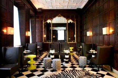
a belated birthday dinner had me at the barclay prime last night (thanks mikey), and overall the experience was very good. designed by india mahdavi, the lounge and dining room have the flair and coloration of a classic 1960's spy flick: dark wood tones, creams, blacks, and the occasional lime green for pop... a great start.
walking in, you're immediately greeted with a host station flanked by a small dining area on the left and a lounge on the right. it's a rather comfortable space- open, airy, and not at all intimidating. the lounge and front dining area are both fully-panelled black walnut in a style that appears to be original to the historic building. further a black-and-white marble floor travels throughout. juxtaposed with these classic details are furnishings that have a much more modern slant: flat-upholstered leather chairs, eames-like green stools, as well as ottomans upholstered in a black & white geometric motif. several other pieces like the vintage tripartite mirror, zebra skin rug, and fabric-wrapped wall sconces help bridge the divergent eras.

(main dining room)
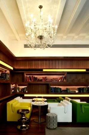
escorted by the host into the main dining area, the eye immediately notices the colorful seating- armchairs of white, green, and yellow (note- the basic elements of lime...) these surround the steel and lucite pedestal tables dotting the room. additionally, the lounge's stools reappear briefly, only this time clad in polished steel. lining 3 walls of the room are "floating," cove-lit walnut bookshelves, complete with art and architecture volumes. lastly, elegant murano(?) glass chandeliers share space with a modern-coffered ceiling, another nod to the meeting of two eras. the lighting is further enhanced by pedestal lights by the windows, adding to the "study" theme of the room.
while the space looked pretty good, it could use a bit of tweaking in my opinion. some suggestions:
*at such expensive prices, the sense of luxury here should be palpable*
one other problem i found (and i always seem to find at starr's places) was the seating: comfortable to relax in, but unsuitable for dining. especially in a steakhouse like this, you must be able to get "above" your food to cut it... the feeling is comparable to sitting on your couch while eating at your dining room table- it just doesn't work. after dinner, i found the chairs much more appropriate, especially after the cocktails, bottle of wine, hearty meal, and dessert. :)
(side note- you know that i've now permanently ruined you for seating at starr's places, right? sorry.)
lastly, i had to check out the bathroom. often that's where designers like to have the most fun: it's small, out of the way, and people only visit briefly. these did not dissappoint. a mosaic combo of brushed and reflective stainless steel tiles dot the unisex walls make for a luxurious feel. additionally, individual stalls with doors that travel from floor to ceiling have their own small mirrors for inconspicuous touch ups as well as speakers to drown out noises from beyond. lastly, modern pedestal sinks and contemporary nickel faucets round out the space.
in the end, i wasn't disappointed with the barclay prime. even though i might have changed a few things, all in all the place felt pretty good. besides, you can't anticipate the minutia of every design, especially in as large-a-scale space as this. what's more- even using an international designer such as mahdavi gives credit to the owner in my book. more people should follow starr's lead here, not just for desitination dining, but really to make the experience as whole as possible...
visit the barclay prime's website here. more pics, menus, hours, etc.
(all photos courtesy sro)

No comments:
Post a Comment