oops, new site host!

in a moment you'll be redirected to

designphiladelphia

11.14.2006

everything that's wrong with america

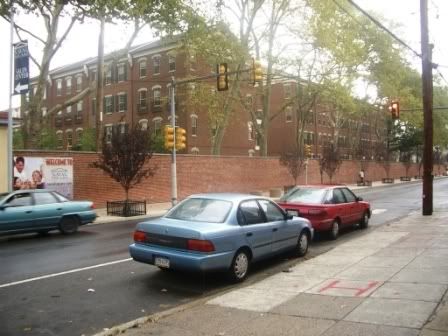
grouped on just a few acres in lovely philadelphia...


1. toll brothers

2. gated communities

3. obnoxious signage

4. rubber stamp design

5. urban "renewal"

6. rich white people

philly independent media center - "a disturbing pattern of manipulation and hardball tactics" yikes.

phily blog - locals speak out, good times

the mad pigeon - article on the mcmansion expansion

anti-toll bro blog - need i say more?

toll bro site - evil resides in horsham, apparently

10.24.2006

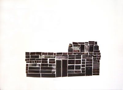
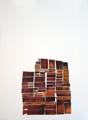
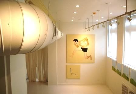
studies of organized living

this isn't something you see everyday...


"It is the life of this order that I am most interested in; finding it among the ruins of everyday happenings is my comforting obsession."

-leslie mutchler


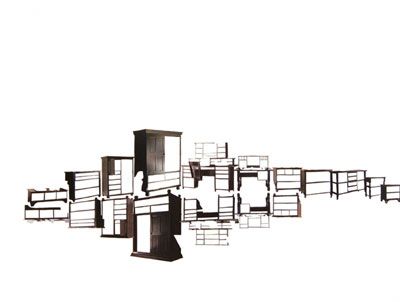
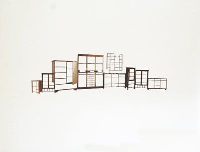
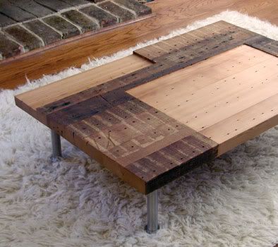
a collage of pottery barn and pier one catalogue pics reinvented into a psychological treatise on art... pretty damn cool.

what leslie manages isn't unlike what warhol did with campbell soup cans. though instead of graphics as art, she's transformed industrial designs as graphics... neat. expect to see this design-as-art trend open up in the months and years to come. personally, i can't wait. ;)


the painted bride art center- opening reception on 11/3/06 from 5-7pm

artist's page on inliquid- more pictures and contact info

(all pics courtesy inliquid.com)

10.16.2006

change in program

thesis year begins...


and so ends phase 1 of this bloggity blog. so sad, so sad.

i'll continue, however, with a more thesis-based study here.... stay tuned for questions, answers, pictures, faces, places, facts and figures in my travels. it won't all be fun and games, but i'll try to keep it interesting at least.

not only will it give me a organizing principle to work around, but my year-end project coincidentally requires a local space... *raises eyebrow* so like it says in the banner, i'm still a local boy/design nut engaging the city of brotherly love. good times.

a hint at my thesis below, more to come...

auburn university's rural studio

9.12.2006

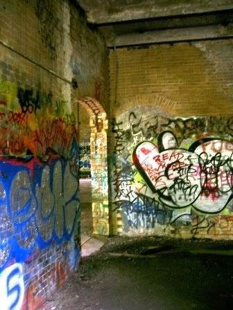
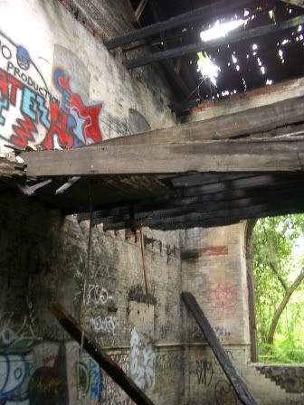
haunted places/forgotten spaces

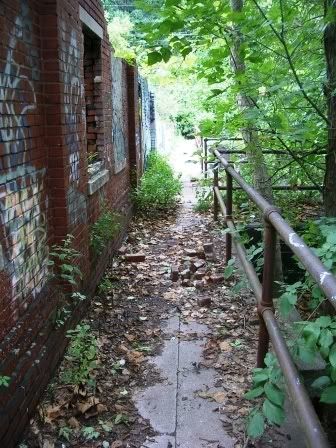
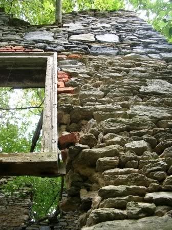
found along the schuykill river trail...


mad mad entropy... i like how some of the hard architectural lines remain despite the softening from the encroaching surrounds. even more so, the grafitti adds a great element to the dynamic, complicating the issue of old versus new... the wear and wholly apparent aging of it all really makes the whole thing work.

ok ok, enough with the academia... ;)

i couldn't post them all, so see more images here if you're so inclined. enjoy!

8.26.2006

retreat

how many of your bosses give you the keys to their country home, hmm?


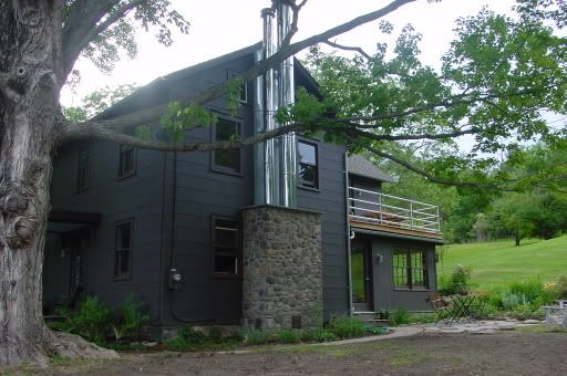
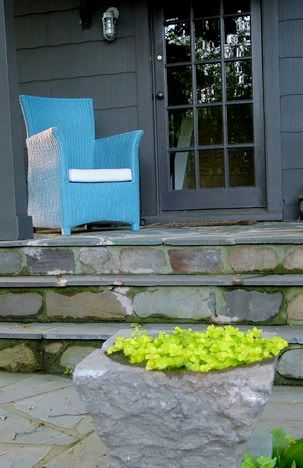
last weekend was spent in a cozy hamlet situated between stroudsburg and jim thorpe (that's coal country to those in the know). a nearby stream, huge flea market, and a home chock full of amenities made it one to remember.

in the interest of objectivity, i'll let the pictures speak for themselves... suffice it to say the place is fan-friggin-tastic. thanks to rj/warren for the hospitality. ;)

8.15.2006

sunday in the park

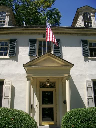
introducing fairmount's strawberry mansion & mount pleasant...

traditional parlor

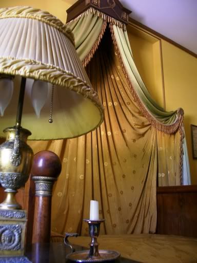
best bedroom ever

unfurnished study

triparte window, hallway

study house, undergoing renovation

just two of eight villas, available for tours through december...

more:
fairmount park website- pics, history, and info for dozens of other park homes/buildings

fairmount park trust- how to adopt or be a caretaker for a historic property... (which really is pretty damned cool if you ask me.)

enjoy.

8.10.2006

gallery 339

details details details...


yeah, that last picture isn't mine. nice though, huh? ;)

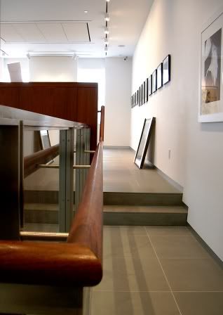
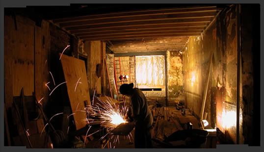
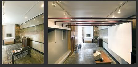
"philly's only fine art photography gallery," 339's most recent incarnation opened just last year. a former apothecary and ice cream parlor, the space was a cored-out shell when architects came onto the scene. little more than the masonry and a hole in the floor where stairs used to be, according to principal martin mcnamara... nothing like starting with a clean slate, right?

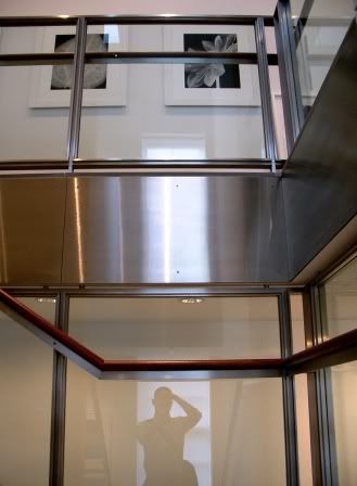
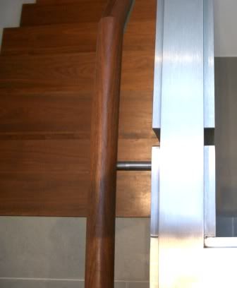
the multidisciplinary architecture team of qb3 (sense a trend here?) originally was asked to design just the central stair, though their skill in this regard prompted a full-time gig with the project. speaking of circulation, this one's a beauty: glass, polished steel, and a rich, dark wood orchestrate movement through the space that's both elegant and sensible. and like the tagline above says, the details! my oh my, simply stunning...

the traditional white cube gallery remains intact here, but departs in the most subtle manner. besides the staircase, 339 also features 180-degree pivoting display "pages" in the front, savvy materiality transitions to designate space, and an understated relationship of in/outside. this sophisticated interplay alongside fine art photography has a way, i believe, of elevating both. not only offering the art a suitable space in which to be viewed, but likewise furnishing the space with work of an appropriate brilliance...

plus they've got some real neat-o photos too! besides national trendsetters, local heroes are featured as well: sara stolfa's curtain call will be held at 339 in september. see below for details.

gallery 339 homepage- hours, exhibits, pictures, and more... ms. stolfa's work can be seen under the artists link.

qb3 site- architecture-graphic-industrial designers extraordinaire. pretty pictures too. enjoy. ;)

7.31.2006

multi moto

lookee what's hiding out in north philly...

(thesis house construction)

(exterior)

(interior)

their frontier approach is just one aspect of moto that i like. the sophisticated use of humble materials, delicate bows to eames-era modernism, and their novel concept of space are amongst others. and did i mention these are rather recent grads too? good stuff.

what's more, the shop's just one of 3 blended ingredients that form what we in da biz call a multidisciplinary approach to design... usually composed of the arch-interior-graphic factions, moto and its collaborators instead go with arch-web-build, which makes a hell of a lot of sense and produces some rather stunning results...

following the processes of design from concept to full completion (that's the build part, natch), this team's managed to keep their specialties secure, their budgets low, and their creativity intact. and like i said, it just makes sense. you have one body creating the marketing & presentation materials, a second laying out the concept & specifications, and the third follows through in the construction phases. as a collective, this troupe can thrive where others may falter and fail. pretty damn smart, if you ask me.

check out motos' and their partners' work below:

agito design

20/2 collaborative- moto's new web address as of 2/15/07

(photos courtesy moto design shop)

7.18.2006

the continental midtown (sorry, stephen)

maybe it looked better on paper?


i don't even know where to begin with this...

3-floors of sheer design monstrosity, the continental midtown is credited with breathing new life into what was once an ailing chestnut street corridor. however garrish, tacky, and all around obnoxious the life may be, you can't deny there's more of it. (if you've ever been around on a friday or saturday night, you know exactly what i mean.)

outside, the midtown announces itself with an oversized arrow paired with a martini olive, a nod to the original continental's pendant fixtures. out-of-place hexagonal red tiles backdrop flimsy-looking table-chair sets and a couple (2) ferns in plastic containers for a sad-looking street view. on the second tier, a series of new circular windows (installed a full year after opening, oops) sit in what appear to be square cutouts... ? double oops. the third floor shows very clearly the office within at night while the top floor houses some thirsty-looking plants and a large sky lounge/bar... about which i oddly don't have anything bad to say. go fig.

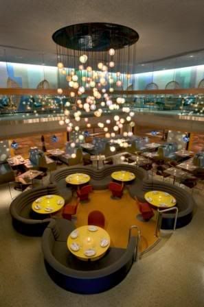
entering the space, please be careful not to get caught behind the automatic-sliding-door-vestibule/airlock, which will invetibly happen if there's even one person waiting at the host station. not sure why it's so damn close to the front door, unless maybe that was an afterthought too? likely so. whatever the case may be, once inside the double-story space announces itself quite well: mod-green booths line the perimeter wall, a sunken floor holds several large banquets in the center, and a colorful glass-globe chandelier drops down from above. the retro vibe is apparent and wholly kitsch, but fun nonetheless.

you may notice, however, a few mis-steps in the first floor design. like those same outdoor tables now oddly clustered in the back of the room (surely a buzzkill to any would-be scenester). or maybe your eyes caught the glittered popcorn, yes popcorn, ceiling. and did you take note of the waiting guests standing against the stairwall? perfectly in the way of servers running food around a blind corner. and my, that sunken space in the middle is awfully large, isn't it? yes, it is.

on the second floor, most apparent are the large, hanging, wicker.. basket... chairs? wicker.hanging.moving.seats.... eating / drinking / moving / digesting... ? i just don't get it.

there's also banquet seating here, which makes sense in the space. and they would work well, if only they could get the seat heights match. it's a quietly disturbing sensation to be at 30" off the floor while your dining companion is at 36". you should try it sometime. or not.

ok, in the back there's carpet on the ceiling, a few plastic animal-like seats, and some mildly interesting tables too. sorry, i'm getting tired here...

let's finish our complaints in bullets:


  • an elevator that only holds six, doesn't stop at the second floor, and is remarkably slow.
  • servers in clothes at least 3 sizes too short/small. can you say overhang??
  • less offensive, but equally annoying: 6 barstools in a space that could easily hold 12.
  • bathrooms with two-way mirrors OR scuzzy carwash flap entryways- your choice!
  • vibrating buzzers for waiting guests ala the olive garden. now that's hospitaliano.
  • last but not least: THIS ISN'T MIDTOWN!
  • umm, sooo.... i like their mashed potatoes?

    more stuff:

    stokes architecture- should have their good taste license suspended. bad architect! BAD.

    continental midtown website- yep, that's them.

    (some photos courtesy sro. oops.)

    7.08.2006

    first friday fun @ the fabric workshop

    oh my my my my my my my...


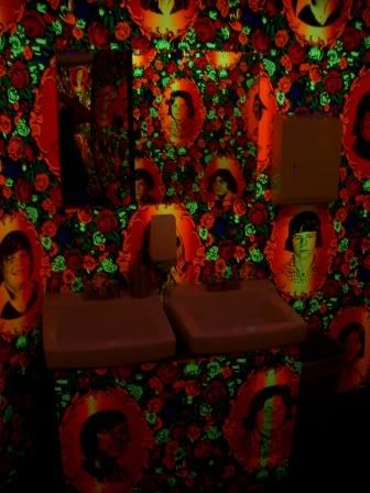
    blacklight danny partridge prints in the bathroom, umbrellas hanging down from above, fabric trim in lieu of soffits... fantastic stuff.

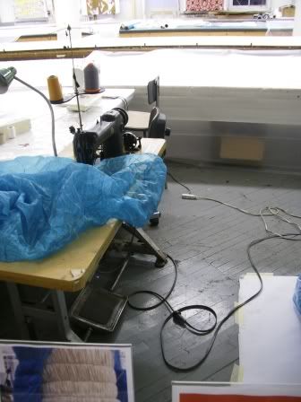
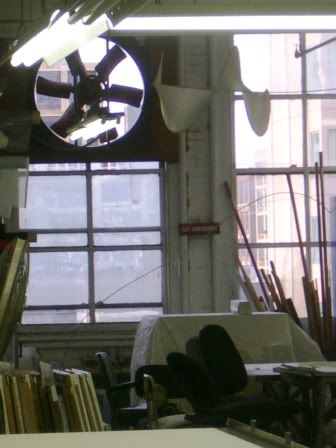
    i'm embarrassed to say last night was my first glimpse at the fabric workshop & museum... unfortunate that until this point i've been missing out on all the fun. this is not old biddies knitting socks, people... creative, fresh-minded people- young and old, men and women- turn out some really great items here (in what i consider one of the better gallery spaces i've seen). and the people agree- last night was jampacked full of those in the know.

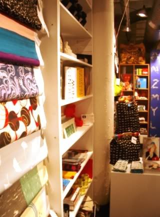
    and i haven't even touched on the workshop's store, factory, or sidestage displays.

    side note- louise bourgeois is the current exhibition, which includes both the obligatory fiberwork as well as a multimedia performance video. a very intriguing exhibit from an artist with a sculptural background... you may have noticed another work of hers in town recently- the giant spider on the steps of the art museum. absolute madness, i love it.

    more info:

    fabric workshop and museum website- mission statement, fantastic pics, reviews, artists-in-residence, how to support, their history, just tons and tons of useful info

    philly weekly's recent article- the workshop et al vs the pa convention center spread

    jorge pardo, the man behind their recent renovations- an artist/designer who gets it, very nice. ;)
    6.27.2006

    iannone:sanderson

    ecostyle defined...
    (signature 1.0 cabinet)

    (custom, using reclaimed fir found on site)

    (custom, complete with backlit bamboo resin panels)

    "clean modern lines and a focus on environmentally-friendly materials" pretty much sums up the local design duo iannone:sanderson. featured at this years international contemporary furniture fair, the studio's innovative use of form and materials have been highlighted in several online and print publications. and for good reason: though green trends in design have been an recurrent theme in recent years, very few have been able to marry it with grace, style, and swagger like they have...

    worth noting: the team is comprised of michael iannone and james sanderson, two young guys with a bfa in studio art and ba engineering/m.arch, respectively. educated out of state and building their biz here in philly, the two show that design doesn't have to be limited to select generations, degrees, or locales. very important to remember, if you ask me... are you hearin this, philly???

    metropolis mag writeup

    home and garden article

    iannone:sanderson website- more links, photos, and bios too...

    6.11.2006

    side stage- art for the cash poor


    business meets nonprofit in the art furniture experience. benefitting both inliquid and habitat for humanity, the exercise asked local artists to enhance a simple chair provided by dane decor...


    not bad, though i think the the most successful item is the least likely to get a high bid:


    there's a push-pull of form/function going on in each of the entries, which really is what separates art and design, afterall... functionally, an artist slapping a print on a chair isn't terribly exciting- the graphic entries look pretty enough, but don't say much... formally, on the other hand, transforming a chair with overwhelming materiality and a sense of it's own entropy is kinda smart. i'd buy it, but a $200 opening bid is a little off my price point. maybe next year... ;)

    dane decor - local contemporary furniture

    inliquid- local art community news, links, happenings, etc.

    habitat for humanity

    6.04.2006

    f.u.e.l. follow-up

    post-mtv, the seaman's church institute has a new lease on life...


    very excited to see the reincarnation of the once-garrish mtv house. while a somewhat traditional white cube gallery, the historic elements of the former church (like marble mouldings and crystal chandelier) offset and enrich an otherwise spartan interior. further, these transitional bits also play on the work displayed, creating an interesting dialogue between space and subject.

    hmm... i'm not sure the space is presently too large-scale, however. perhaps the addition of sculptural works, seating, or even a mock-foyer could help scale it down?

    of course, the current exhibition is fantastic still. make sure to check out dustin kemper's work on the second floor- really something else, that.

    previous post, pre-renovation- includes info on f.u.el., the church, more pics, etc.