oops, new site host!

in a moment you'll be redirected to

designphiladelphia

7.31.2006

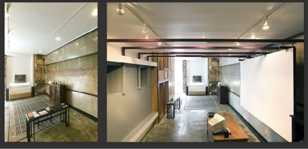
multi moto

lookee what's hiding out in north philly...

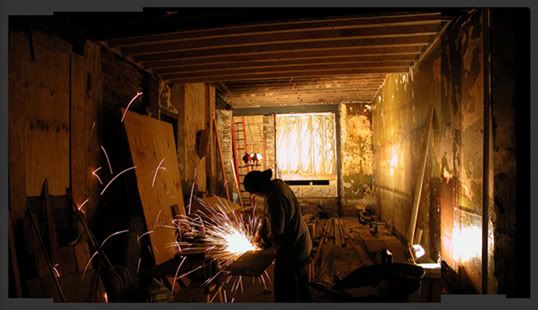
(thesis house construction)

(exterior)

(interior)

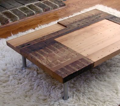
their frontier approach is just one aspect of moto that i like. the sophisticated use of humble materials, delicate bows to eames-era modernism, and their novel concept of space are amongst others. and did i mention these are rather recent grads too? good stuff.

what's more, the shop's just one of 3 blended ingredients that form what we in da biz call a multidisciplinary approach to design... usually composed of the arch-interior-graphic factions, moto and its collaborators instead go with arch-web-build, which makes a hell of a lot of sense and produces some rather stunning results...

following the processes of design from concept to full completion (that's the build part, natch), this team's managed to keep their specialties secure, their budgets low, and their creativity intact. and like i said, it just makes sense. you have one body creating the marketing & presentation materials, a second laying out the concept & specifications, and the third follows through in the construction phases. as a collective, this troupe can thrive where others may falter and fail. pretty damn smart, if you ask me.

check out motos' and their partners' work below:

agito design

20/2 collaborative- moto's new web address as of 2/15/07

(photos courtesy moto design shop)

7.18.2006

the continental midtown (sorry, stephen)

maybe it looked better on paper?


i don't even know where to begin with this...

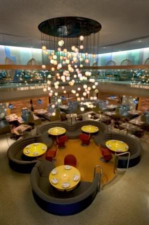
3-floors of sheer design monstrosity, the continental midtown is credited with breathing new life into what was once an ailing chestnut street corridor. however garrish, tacky, and all around obnoxious the life may be, you can't deny there's more of it. (if you've ever been around on a friday or saturday night, you know exactly what i mean.)

outside, the midtown announces itself with an oversized arrow paired with a martini olive, a nod to the original continental's pendant fixtures. out-of-place hexagonal red tiles backdrop flimsy-looking table-chair sets and a couple (2) ferns in plastic containers for a sad-looking street view. on the second tier, a series of new circular windows (installed a full year after opening, oops) sit in what appear to be square cutouts... ? double oops. the third floor shows very clearly the office within at night while the top floor houses some thirsty-looking plants and a large sky lounge/bar... about which i oddly don't have anything bad to say. go fig.

entering the space, please be careful not to get caught behind the automatic-sliding-door-vestibule/airlock, which will invetibly happen if there's even one person waiting at the host station. not sure why it's so damn close to the front door, unless maybe that was an afterthought too? likely so. whatever the case may be, once inside the double-story space announces itself quite well: mod-green booths line the perimeter wall, a sunken floor holds several large banquets in the center, and a colorful glass-globe chandelier drops down from above. the retro vibe is apparent and wholly kitsch, but fun nonetheless.

you may notice, however, a few mis-steps in the first floor design. like those same outdoor tables now oddly clustered in the back of the room (surely a buzzkill to any would-be scenester). or maybe your eyes caught the glittered popcorn, yes popcorn, ceiling. and did you take note of the waiting guests standing against the stairwall? perfectly in the way of servers running food around a blind corner. and my, that sunken space in the middle is awfully large, isn't it? yes, it is.

on the second floor, most apparent are the large, hanging, wicker.. basket... chairs? wicker.hanging.moving.seats.... eating / drinking / moving / digesting... ? i just don't get it.

there's also banquet seating here, which makes sense in the space. and they would work well, if only they could get the seat heights match. it's a quietly disturbing sensation to be at 30" off the floor while your dining companion is at 36". you should try it sometime. or not.

ok, in the back there's carpet on the ceiling, a few plastic animal-like seats, and some mildly interesting tables too. sorry, i'm getting tired here...

let's finish our complaints in bullets:


  • an elevator that only holds six, doesn't stop at the second floor, and is remarkably slow.
  • servers in clothes at least 3 sizes too short/small. can you say overhang??
  • less offensive, but equally annoying: 6 barstools in a space that could easily hold 12.
  • bathrooms with two-way mirrors OR scuzzy carwash flap entryways- your choice!
  • vibrating buzzers for waiting guests ala the olive garden. now that's hospitaliano.
  • last but not least: THIS ISN'T MIDTOWN!
  • umm, sooo.... i like their mashed potatoes?

    more stuff:

    stokes architecture- should have their good taste license suspended. bad architect! BAD.

    continental midtown website- yep, that's them.

    (some photos courtesy sro. oops.)
    7.08.2006

    first friday fun @ the fabric workshop

    oh my my my my my my my...


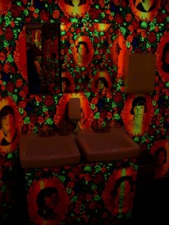
    blacklight danny partridge prints in the bathroom, umbrellas hanging down from above, fabric trim in lieu of soffits... fantastic stuff.

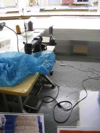
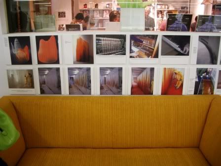
    i'm embarrassed to say last night was my first glimpse at the fabric workshop & museum... unfortunate that until this point i've been missing out on all the fun. this is not old biddies knitting socks, people... creative, fresh-minded people- young and old, men and women- turn out some really great items here (in what i consider one of the better gallery spaces i've seen). and the people agree- last night was jampacked full of those in the know.

    and i haven't even touched on the workshop's store, factory, or sidestage displays.

    side note- louise bourgeois is the current exhibition, which includes both the obligatory fiberwork as well as a multimedia performance video. a very intriguing exhibit from an artist with a sculptural background... you may have noticed another work of hers in town recently- the giant spider on the steps of the art museum. absolute madness, i love it.

    more info:

    fabric workshop and museum website- mission statement, fantastic pics, reviews, artists-in-residence, how to support, their history, just tons and tons of useful info

    philly weekly's recent article- the workshop et al vs the pa convention center spread

    jorge pardo, the man behind their recent renovations- an artist/designer who gets it, very nice. ;)

    6.27.2006

    iannone:sanderson

    ecostyle defined...
    (signature 1.0 cabinet)

    (custom, using reclaimed fir found on site)

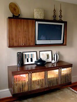
    (custom, complete with backlit bamboo resin panels)

    "clean modern lines and a focus on environmentally-friendly materials" pretty much sums up the local design duo iannone:sanderson. featured at this years international contemporary furniture fair, the studio's innovative use of form and materials have been highlighted in several online and print publications. and for good reason: though green trends in design have been an recurrent theme in recent years, very few have been able to marry it with grace, style, and swagger like they have...

    worth noting: the team is comprised of michael iannone and james sanderson, two young guys with a bfa in studio art and ba engineering/m.arch, respectively. educated out of state and building their biz here in philly, the two show that design doesn't have to be limited to select generations, degrees, or locales. very important to remember, if you ask me... are you hearin this, philly???

    metropolis mag writeup

    home and garden article

    iannone:sanderson website- more links, photos, and bios too...

    6.11.2006

    side stage- art for the cash poor


    business meets nonprofit in the art furniture experience. benefitting both inliquid and habitat for humanity, the exercise asked local artists to enhance a simple chair provided by dane decor...


    not bad, though i think the the most successful item is the least likely to get a high bid:


    there's a push-pull of form/function going on in each of the entries, which really is what separates art and design, afterall... functionally, an artist slapping a print on a chair isn't terribly exciting- the graphic entries look pretty enough, but don't say much... formally, on the other hand, transforming a chair with overwhelming materiality and a sense of it's own entropy is kinda smart. i'd buy it, but a $200 opening bid is a little off my price point. maybe next year... ;)

    dane decor - local contemporary furniture

    inliquid- local art community news, links, happenings, etc.

    habitat for humanity

    6.04.2006

    f.u.e.l. follow-up

    post-mtv, the seaman's church institute has a new lease on life...


    very excited to see the reincarnation of the once-garrish mtv house. while a somewhat traditional white cube gallery, the historic elements of the former church (like marble mouldings and crystal chandelier) offset and enrich an otherwise spartan interior. further, these transitional bits also play on the work displayed, creating an interesting dialogue between space and subject.

    hmm... i'm not sure the space is presently too large-scale, however. perhaps the addition of sculptural works, seating, or even a mock-foyer could help scale it down?

    of course, the current exhibition is fantastic still. make sure to check out dustin kemper's work on the second floor- really something else, that.

    previous post, pre-renovation- includes info on f.u.el., the church, more pics, etc.

    5.31.2006

    avoidance tactics


    play with camera or dimension floor plans? hmm, tough choice.


    just 2 more weeks till freedom...

    5.18.2006

    affordable art

    why update your space with mass-produced trash when you can shop local and authentic???

    "this popular, block-party style event features local arts organizations and 100+ artists showing and selling affordable artwork for every budget (nothing over $199), plus live music, raffle, food, and drink..." sounds like a good time to me!

    saturday, june 10th 1-8pm @ the crane arts building, 1400 north american street.

    inliquid- local arts non-profit with tons of pictures, links, events, biographies, and more

    5.14.2006

    23rd & arch


    went on a recent scouting mission to check out the renovation...

    (formerly)

    (interior)

    (double-wide)

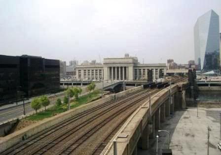
    (view)

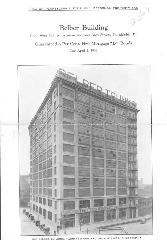
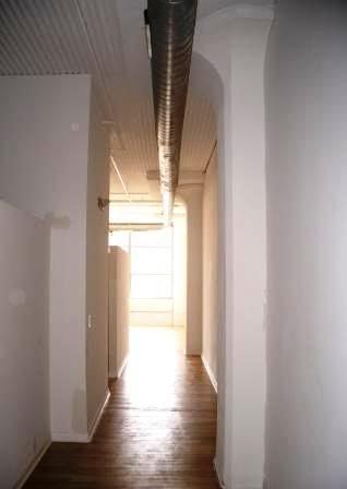
    apparently the building hasn't changed much since 1936's belber trunk factory: exposed decking, concrete (with scattered masonry) walls, and tulipped columns remain. reconstruction is still in the early stages of rehabitation though, with floors 6 and above (seen in the 2nd interior pic) pretty much unrecognizable as condo-space...

    major flaw: half walls for a two-bedroom apartment. per code, you can't have full height walls in bedrooms without windows. guess privacy can't be too high a priority for potential residents...

    so-so, not bad: raised bedrooms and/or living areas. level changes make spaces feel more special, plus give you different eyelines throughhout... which could be good OR bad, depending on the quality of your interiors person.

    good stuff: (tie) a super-fast glass elevator and some really nice views of the city.

    more:

    philadelphia historic photo archive- organized by location

    orens brothers- developers

    wulff architects- in chrage of renovation. check out the original plans for the building under multi-familt residential, yikes

    5.10.2006

    not your everyday remedy...

    situated in the middle of an otherwise-un-noteworthy strip of sansom street is a cozy haven for designers and tea aficionados alike. opened just last year, remedy tea reflects the personal aesthetic of sisters kristen and courtney kammerer in both offerings and environment:


    i can't get enough of that chandelier...

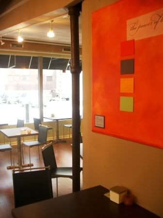
    what was once an abandoned storefront has been made truly invigorating by the duo. a large space is made comfortable and more inviting by the use of varied materials and bold colors. chocolate wood tones, antique whites, lime green and -my personal fave- electric orange metallics all combine to make for an uplifting, yet comfortable experience. add modern furnishings, raw concrete, & auction-bought chandelier too??? fantastic stuff.

    my drink of choice is their take on the cosmo... with passionfruit iced tea, cranberry juice & lime juice, mmm...

    remedy tea online- history, press, and menus... enjoy!


    5.01.2006

    summer camp!

    this ain't basket-weaving and faux finishes people...


    (fiber arts)

    (fine metals)

    (ceramics)

    i'm considering a summer course at peters valley, just to round out my design experience a bit (it gets a touch stuffy in the studio day in and day out, yaknow).

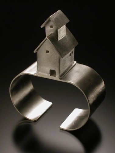
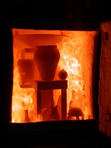
    while my tastes have me mulling over "furniture design" versus "sculptureworks" as choices, you may find sexier titles like "kilns that will kill you," "experimental machine knitting," or "intimacy with metals" more to your liking. classes begin various times throughout the summer...

    peters valley official site- class descriptions, pics, costs, schedules, etc etc etc

    4.28.2006

    church of the new jerusalem aka swedenborgin church

    kinda makes "first unitarian" sound a bit boring, doesn't it?

    however eyecatching, the name's deceiving: what was once hallowed ground has long been de-sanctified, so it doesn't even get the title "church" any longer. instead, the space has played host to a number of secular businesses in the past and has been vacant for almost a year now. however, the site at 22nd and chesntut streets recently acquired some new tenants.... and through the generosity of a good friend (thanks chris!), i was able to attend their much-anticipated welcoming reception last night.

    but before i offer up the requisite photos, let me prelude with this:

    while the outside remained true to the original, walking by i could only imagine what was left of the guts of the space. developers of corporate culture, as sensitive to architectural history as they can be... yeah right.... very easily have covered, removed, and even destroyed the works of long-forgotten artisans and craftsman time and time again. at the risk of sounding melodramatic, i was sure the space had been ruined forever...

    all i can say is, i'm glad i was wrong:


    mark b thompson architects- also behind the renovations of the waterworks and reading terminal

    philadelphia area buildings- pictures and history of the site, membership required

    corporate facilities inc- new tenants who throw a damned good party ;)

    4.23.2006

    cadida hofer, must see

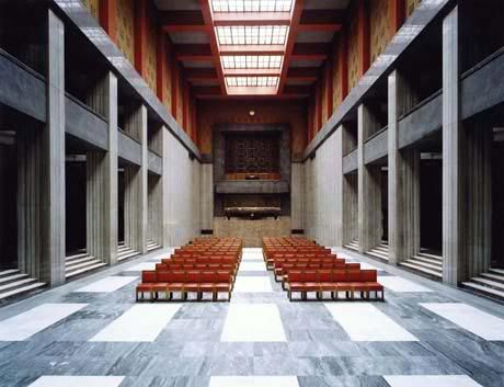
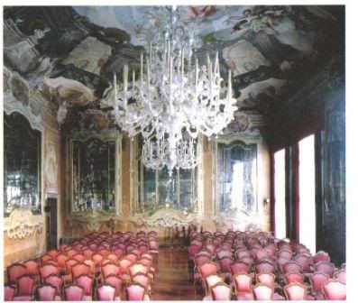
    from may 3-july 30, candida hofer's "architecture of absence" will be on display at the institute of contemporary art at the university of pennsylvania. her advert/postcard reads in part:

    [she] photographs grand interior spaces overtaken by an exquisite sense of stillness... absence is signaled everywhere by empty chairs, podiums, and arenas around the world that call out to be occupied.


    the only way i can describe her work is as if i'm on the precipice of seizing... it's absolutely *sick* (slang, a good thing) the way she's able to capture this odd, biological nature of a space without a human population. it's a great marriage of art, architecture, and interior design, in my opinion. i can't wait to see her work in person, and wish me luck sneaking into the opening night... ;)

    more eye candy:
    former exhibition pics with bio
    upcoming show at the institute of contemporary art

    (pictures courtesy ica and r. bransten)

    visual pollution

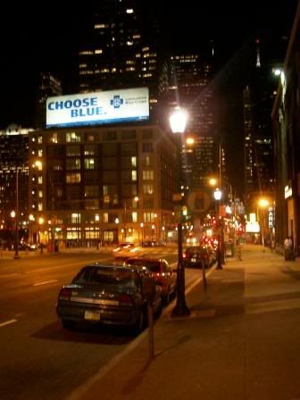
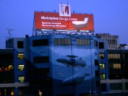
    on my daily commute...


    society created to reduce urban blight- local philly group! contains everything you need to know about billboards and other pollution in the city. pics, links, cases, press and more... good stuff.

    scenic america site- the good guys

    outdoor advertising association of america- the bad guys

    "culture jamming"- spinoff topic, using billboards to combat advertising